Thursday, January 22, 2009

Bad photo advice of the day

I subscribe to a number of Google Blog Alerts on subjects relating to photography. One of those alerts is set to gather blog posts that provide Photography Tips. I've learned some valuable things from a few of those posts. The majority, however, are pure dreck. Here's an example:
A photograph or an image which does not have life - 'the X factor' as they call it - is simply wastage. Efficient commercial photographers know how to put life in the images that they click. And how do they do it? There are simple but fundamental principles that guide the rules to create a good image.

For one thing, I don't call it the "X Factor." I don't know any professional photographer who does. And I also have a fair idea of how to inject "life" into a photo, even though the word "life" is so broad as to be almost meaningless.

Anyway, what are the three vital principles for guaranteeing your pictures don't emerge from your camera DOA? This expert says that every photo needs light, a subject and a background.

Gosh. I never knew. I thought every photo needed a camera, a lens and a clicking finger.

Here's a good rule of thumb to use when perusing photo advice sites: If they don't post sample photos along with their prose, just click your browser's "Back" button. Fast.

Labels:

Wednesday, January 14, 2009

Making your own luck

If you've been following my series on post-processing digital images, you might be interested in a recent blog post by professional children's photographer Kelly Ferreira. She walks through her thought process while photographing her two daughters, and provides plenty of examples and before-and-after shots along the way.

Labels: ,

Monday, January 12, 2009

Recapturing lost details in a photo via layers in Photoshop

I love old barns. It was a photographic treat to have one at my disposal at a local forest preserve.

The two photos above show what a little effort in Photoshop Elements can do for your pictures. The bottom photo is what came out of my camera. The contrast between the stone wall, red barn and white snow resulted in a pretty good picture. But are we satisfied with pretty good when we can have fabulous? No!

For one thing, the details in the foreground snow are lost. To get them back, I copied the photo and pasted it as a layer over the original. I then inverted the layer (Select All/Filter/Adjustments/Invert), which created a negative image. Then I selected Soft Light in the Layers dialog box. Hello, snowy details! I played with the Opacity setting slider until I was satisfied with the look - I wound up at just above 50% opacity.

While that action rescued the snow, it played havoc with the barn and stone wall, so I selected the barn and stone wall with the Polygonal Lasso Tool, added an 8-pixel feather and deleted them from the layer, exposing the barn and fence from the background layer below. I then flattened the image, cranked up the color saturation about 15% and applied an Unsharp Mask at 200%, 1.0 Pixel and 0 Threshold.

I then added a faint vignette - I used the Elliptical Marquee Tool to select nearly the entire photo. Feathered the selection at 240 pixels, then inverted the selection. Went to Enhance/Adjust Lighting/Levels and slid the right Output Level slider to 220, which darkened the edges of the photo slightly. I then added some soft blur (Filter/Blur/Gaussian Blur at 8.0 pixels).

The inverted layer/Soft Light combo is a great way to recapture details that might have gotten lost in the shadows and highlights of your pictures.

Photographs © 2009 James Jordan.

Labels: ,

Friday, January 9, 2009

A word about Unsharp Mask

When it comes to digital photo editing, your best friend in the world will be the Unsharp Mask feature. Why? Because the Unsharp Mask will make your pictures sharper.

It sounds oxymoronic, but the term originated back in the early days of darkrooms and film. Someone figured out that if a negative was not quite in focus, it could be fixed to an extent by producing a slightly blurred negative of the original negative then sandwiching it with the original. The unsharp image masked some of the blur in the original negative when a print was made from the pair. This setup added contrast to the edges of the tones of the photo, giving the appearance of increased sharpness. Don’t ask me how it works. It just does. Anyway, the blurred duplicate became known as an unsharp mask. That’s all I’ll say about that.

The Unsharp Mask feature of Photoshop, et al, does basically the same thing as its filmy counterpart. It increases the contrast at the edges of a photo’s tones, giving the appearance of more sharpness. (Note: If your photo editing program only has a Sharpen feature, it's really an Unsharp Mask - it's just pre-set and cannot be adjusted.)

Your Unsharp Mask dialog box comes equipped with three variables, Amount, Radius and Threshold.

Amount is listed as a percentage, and controls how much contrast is added at the edges of tones.

Radius affects the size of the edges to be enhanced. Fine detail needs a smaller Radius. Radius and Amount interact; reducing one allows more of the other.

Threshold controls how far apart adjacent tonal values have to be before the filter does anything. This lack of action is important to prevent smooth areas from becoming speckled. Low values should sharpen more because fewer areas are excluded. Higher threshold values exclude areas of lower contrast. Sliding the Threshold setting all the way to 255 cancels all sharpening.

I nearly always run my photos through an Unsharp Mask. My default setting on Unsharp Mask is Amount 100, Radius 1.0 and Threshold 0. Depending on the photo, I’ve cranked the amount as high as 500. Since most of my photos have some fine detail, I rarely move the Radius setting. I increase the Threshold if I’m sharpening a portrait or a picture with large areas of even tones.

Open a photo and play with the Unsharp Mask settings to find a combination that works for you.

Photograph © 2008 James Jordan.

Labels: ,

Thursday, January 8, 2009

Do some layering to make your pictures pop

Back in the days when digital photo editing was in its infancy, there were a lot of choices when it came down to which software to use. Each one did pretty much the same things as the others, albeit with different names and menus. Then Adobe did something with its Photoshop software that changed the game. It added the ability to work with layers, and set itself apart from the crowd.

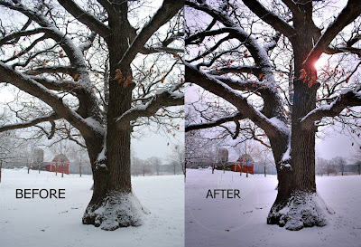
Getting the most out of Photoshop or Photoshop Elements or any photo editing program requires some facility with the programs' Layers options. I've posted a Photoshop Elements tutorial on my photo blog that shows what is possible when using layers and combining them with various effects and filters, using the two photos above as samples. I'll cross post most of those tutorials here, but for today, slide on over to Points of Light to see the first in the series.

Click on picture to enlarge. Photograph © 2009 James Jordan.

Labels: ,