Tuesday, April 14, 2009

A few minutes with ...
I’m going to go all Andy Rooney on you here for a minute and talk about something that bugs me regarding the photo advice I see on the interwebs. People who really should know better use the phrase, “Practice, practice, practice.” I find the phrase wrong, wrong, wrong.

Why? Because the phrase doesn’t tell you what or how to practice. If all you know is how to take pictures that are poorly composed, badly exposed (and that should be disposed), then practicing only cements your bad habits into place, and compounds your frustration. Been there, done that.

Try this instead. Work on just one thing at a time, then practice the heck out of it. For instance, early on in my photography I made up my mind that I was going to master exposure. But not just any exposure, I wanted to own exposure of early morning landscape shots. So I got up early. A lot. I went out and took photos of sunrises and the stuff the sunrise shone on until I could get a good exposure with good details in the highlights and shadows nearly every time (this was in the days of film, so it was a long process. Digital photography allows instant feedback so you can adjust in real time, not days and weeks, as I had to endure).

Then I moved to late afternoon/evening shots and practiced the heck out of those. Then nighttime shots. Then indoor shots. Get the idea? Get good at one thing, then add to it as you go. It makes practice meaningful and you see incremental progress faster.

Want a place to start practicing? Then either click on Basics, Composition or Exposure in the blog tags below to see all posts on Ready, Aim, Click that pertain to those subjects.

Then get practicing.

Labels: , ,

Tuesday, October 28, 2008

Everything that I know about photography I learned from post cards

OK, maybe not, but racks full of postcards draw me like a magnet when I'm out traveling. When my wife notices that I'm no longer walking with her through a store, she knows the first place to look for me. Postcards are a good reference source to see how different photographers approach subjects that have been photographed a million times already.

So, here are some of the things I've learned from postcards about photographing landmarks:

1. Photograph at a time of day when the fewest people are likely to photograph. This is usually around sunrise. Your photo will have a look that relatively few other photos will have.

2. Show the landmark in its surroundings.

3. Isolate the landmark from its surroundings.

4. Photograph the landmark at a time of year when relatively few other people will photograph it. Early spring, peak color in autumn and mid-winter are good choices.

5. If the sky is doing something dramatic ... bonus!

6. Stick to the rules of composition. Or not.

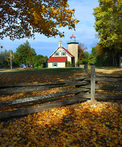
The above photograph of the Eagle Bluff Lighthouse in Door County, Wisconsin is a bit too typical of a "postcard" shot, but it was begging to be taken. Mid-morning on a fall day when the colors had reached their peak. Sun illuminating the lighthouse through a clearing in the surrounding trees. Blue sky creating a contrast of color to the gold and orange leaves. A spot of sunlight hitting the juncture of the split rail fence. I was there with a camera. What else could I do?

Photograph © 2008 James Jordan.

Labels: , ,

Friday, October 10, 2008

A tip for close up shots - back off!

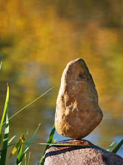
The natural inclination is to shoot a closeup of an object from, well ... close up. For this shot, I stepped back several yards and used a telephoto lens to bring the object to me. This changes the viewing perspective ever so slightly and can result in a shot that is a bit different than what we may be used to seeing and may compel a viewer to stick with it a bit longer than they would have otherwise. It may not work every time, but it's worth playing with as you're out shooting.

Photograph © 2008 James Jordan.

Labels: ,

Saturday, March 17, 2007

Dominant elements

I studied art in college under a gentleman named Harry Worst, a landscape painter who created his compositions in the studio, then would go into the field to find references for the details in his paintings. Harry preached two ideas to the fledgling artists in his flock. One was to build three distinct zones - foreground, middle ground and background - to establish depth. The other was to create a dominant element - one that commanded attention - with all other elements subordinate to it.

Your photographic compositions will benefit from the same advice. I've previously posted about building depth in your photos. Think of the dominant element as the "star" of your photograph and look for ways to make your star grab the attention of your viewer.

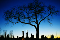
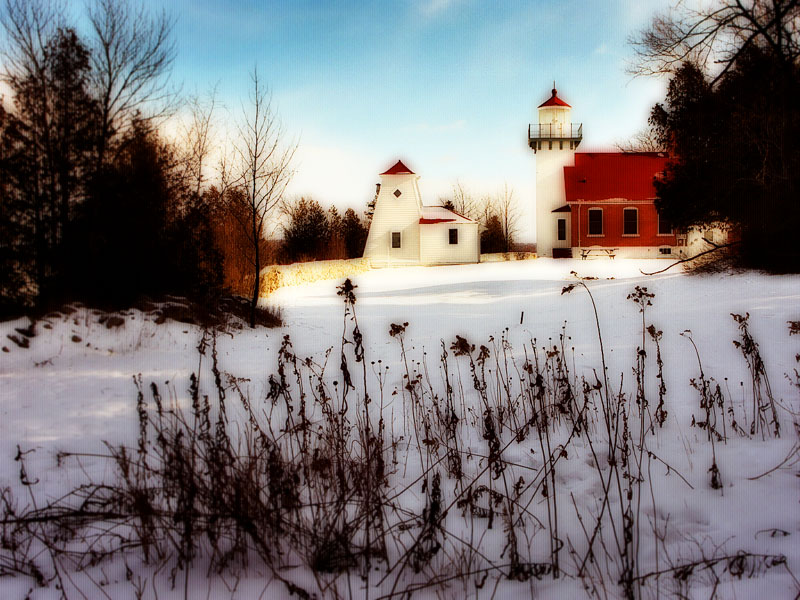
One way is to make your star physically larger than all other elements, as I've done with this tree in a cemetery. Another way is to set it apart is by framing it with other elements, as I've done with the lighthouse in the second photo. The monochrome of the woods and foreground shadows frame the sunlit area in which the lighthouse sits, drawing the viewer's eye. the lighthouse also sits on a diagonal line from top right to bottom left - placing your subject on either of the diagonals of a photo will naturally draw the eye of the viewer.

Click on pictures to enlarge. Photos © 2007 James Jordan.

Labels: ,

Saturday, January 27, 2007

Embrace the V

In yesterday’s post I talked about a theory of composition that I’m forming. If you draw an imaginary line from any corner of your photo to its opposite corner, placing your subject or main item of focus anywhere on that diagonal line will result in a good composition. Go to a photo web site like Flickr, look around and you’ll be surprised at how often you see this in use.

I’m also seeing a lot of compositions that takes advantage of the “V” formed by intersecting the diagonal lines. A lot of photographs, like the one above, nestle their subjects into the crook of one of the “Vs,” again resulting in pleasing compositions. (See smaller diagram.)

With these two practices in mind, along with the good old rule of thirds, you have three weapons in your compositional arsenal. Now get out there and fire away!

Photo: Robinson Crusoe dream place uploaded by Nicolas Valentin to Flickr. Click on pictures to enlarge.

Bonus shot: The subject of this photo occupies a different "V." Check it out.

Labels: ,

Friday, January 26, 2007

Keeping it simple: Composition

A photographer with whom I had the privilege of working when I was a photo buyer had a slogan, “Simple pictures are best.” His pictures were indeed simple and among some of the best I’ve ever seen. I’ve tried to put his philosophy into practice since seriously taking up the hobby of photography eight years ago.

There are two sides to photographic simplicity. There’s the simplicity (or lack of it) in the final image that’s created. Then there’s the simplicity of thought that goes on behind the lens as the picture is being created. I believe the two are related. I’ve studied some complex photographic theories and tried to boil them down to a few simple basics that I regularly use in making pictures, and those are the things I share here at Ready, Aim, Click.

So here’s a simplification of some complex theories of composition. I’ll admit that this is brand new thinking on my part, and I have not had a chance to fully field test it, but count on it that I will.

The rules of composition are based on the golden mean, a classic school of thought based on mathematically-based subdivisions of space that create visually appealing patterns and designs. That’s the complex part. Here’s my simplification: If you draw a diagonal line from any corner of a photograph to its opposite corner, placing your main subject anywhere on that diagonal line will result in a pleasing composition. This assumes that your background is fairly simple and that it’s quite obvious what your subject is.

The large photo at the top has our subject floating on a diagonal line from the top left to bottom right of the frame. The smaller photos are crops that place our subject on various spots on the diagonal lines. The third introduces additional subjects on the opposing diagonal, which opens up other possibilities. Each change in placement creates subtle shifts in meaning for each photo; try framing up several possibilities the next time you're shooting, then decide which one works best for you.

Like I said, I plan to play with this idea and will post some results here in the near future. And I’m not declaring the rule of thirds null and void.

Yet.

Photos © 2007 James Jordan. Click on pictures to enlarge.

Labels: ,

Wednesday, January 17, 2007

Troubleshooting: Lost lighthouse

A friend submitted this photo for a critique and to see if anything could be done to improve it. This is the Crisp Point Lighthouse near Paradise, Michigan on the south shore of Lake Superior. Judging from the shadows, this was probably taken in the early afternoon. The sunlight is quite harsh at midday, and it is always better to try to take outdoor photos in early morning or late afternoon. The light is softer and warmer at those times of day. I know it’s difficult when traveling to make accommodations for early morning or late afternoon shooting, but it’s always worth the effort as far as photos go (this particular lighthouse is way off the beaten path, so you have you take what you get, conditions-wise). My family has come to the understanding that when we’re traveling, dad is going to be out early in the morning and late in the afternoon into early evening taking pictures. The rest of the day is for accompanying the family to shopping or other activities.

But back to the picture at hand. My friend knows enough about composition to put the main subject, the lighthouse, in one of the outer third corners of the picture, but he still came away with the feeling that something may be off. To me, the biggest problem is that the lighthouse seems to be lost in the trees. While my friend established a foreground, middle ground and background in his picture, the trees in the middle ground, through the visual magic of perspective, seem to be as tall as the lighthouse and compete for attention with the tower. So the first order of business is to explore some cropping options to try to isolate the tower and minimize the distraction of the trees.

I explored both a horizontal and vertical crop. I focused on getting the large tree at the left of the picture just out of the frame, keeping as much of the horizon of the lake as possible and minimizing the tall thin pine tree to the right of the tower. I then moved the vertical crop up and down to see if I liked it better with more sky or more foreground foliage. Personally, I prefer the crop with the foliage on the dune, but you can go either way.

A little darkening of the middle tones and a slight boost in color saturation in PhotoShop rounded out my adjustments of the picture. The lighthouse now stands as the undisputed focal point of the photo. By the way, my friend has more photos and some thought-provoking posts at his blog. Check it out.

Do you have a picture you would like critiqued or fixed? Send me an email at jjrdns6[at]aol[dot]com and write "Troubleshooting" in the subject line.

Click on pictures to enlarge.

Labels: , ,

Add depth to your thinking


Tranquility
Originally uploaded by James Jordan.
I took a landscape watercolor painting class while studying art in college. The instructor was the stereotypical artist – white hair, goatee, elegant dresser. As we developed our compositions in class, he walked from easel to easel repeating his mantra, “Foreground, middle ground, background … foreground, middle ground, background.”

It was his way of drilling into us the discipline of creating depth by including details from near to far. Too often, beginning landscape photographers focus on the beautiful background in their pictures. If any middle ground detail makes it into their pictures, it’s a happy accident, and foreground is rarely given any thought. The results are rather flat-looking pictures.

The next time you are composing a picture, try to highlight all three zones – foreground, middle ground and background. And this isn't just for landscapes. When I take snapshots of family, I still pay attention to the three zones - it helps establish a sense of place while adding depth to the picture. I shoot the largest percentage of my photos at a wide angle setting, which helps accentuate depth.

Establishing three distinct zones in a photo is tougher than it sounds, and it takes some practice to become consistent at it, but it makes for more interesting photos.

Click on pictures to enlarge. Photographs © 2007 James Jordan.

Labels: ,

Tuesday, January 16, 2007

Going deeper: The power of diagonal lines


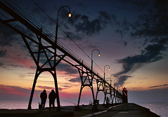
Dusk at South Haven pier
Originally uploaded by James Jordan.
Photographs are two-dimensional images (or at least they will be until they come up with a way to make cheap holograms!). As such, a challenge for photographers is instilling a 3-dimensional quality to their pictures. There are several ways to build depth into a photo. One of the easiest ways is to look for diagonal lines. The eye is trained to interpret diagonal lines as receding into the distance (think railroad tracks or a line of light poles by the side of the road). Any time you can work diagonal lines into a photo, do so. Even better is making the diagonal lines lead to the focal point of the picture.

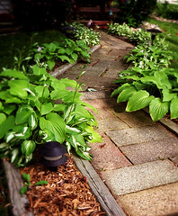
In the examples here, the converging diagonal lines of the pier and catwalk give the impression of depth (a bonus is the two fishermen framed in the support of the catwalk – a third fisherman is framed further down the pier). In the second photo, the alternating diagonals of the winding walkway emphasize depth.

Now, go out there and get crooked!

Photos © 2006 James Jordan. Click on pictures to enlarge.

Labels: ,

Wednesday, January 10, 2007

Bringing interest to the obligatory “we were there” pictures

You know the ones. You visit the mountains or the rocky beach or the untamed wilderness and you line up everyone to stand in a group to look straight into the camera with whatever gorgeous scenery you can still squeeze into the frame behind them. The result is usually a little too much of each (loved ones and scenery) and not enough of either.

When traveling, I’ll usually take one of the above-mentioned shots just to make those who insist on that type of thing happy. Then I’ll go to work creating an environmental portrait of each person who came along. We didn’t come to the place to stand in front of it; we came to see it, to experience it, to interact with it. So that’s the way I want to depict us. I will take candid or loosely posed pictures of people interacting with the environment, not standing stock-still in front of it.

I’ll take photos that show more environment than person, then switch to show more person than environment, leaving just enough clues as to where we were. I also follow some of the other tips I've mentioned on this blog (change your altitude, get out of the center, etc.). What I’ll wind up with is a good variety of interesting shots that then become excellent fodder for scrapbooking (for my wife), or in my case, photo blogging.

These are some photos of the ladies in my life (wife and daughters) along the Lake Michigan shoreline in northern Wisconsin. They give a good sense of the places we visited as well as the special people in my life who visited there. And they're a lot more interesting than if they had stood stock-still in front of the camera.

Photographs © 2007 James Jordan. Click on pictures to enlarge.

Labels: ,

Monday, January 1, 2007

Tip: Avoid the middle of the frame

A sure giveaway of a newbie photographer is a picture that neatly centers the subject smack dab in the middle of the frame. Here’s a tip: Avoid the middle as much as you can.

Classic rules of composition divide the viewing area into thirds: Two lines divide the vertical and horizontal dimensions of your photograph. Where the vertical and horizontal lines cross are where the subject tends to look best. While this rule is not always hard and fast, you’ll find that most photos taken by competent photographers place the subject in the vicinity of these intersections.

There will be times when a symmetrical composition is called for with a subject centered either vertically or horizontally in the frame, but for now, concentrate on getting your subjects out of the center.

Photographs © 2007 James Jordan. Click on pictures to enlarge.

Labels:

Saturday, December 30, 2006

Tip: Look for leading lines

One of the first things I do when looking for a location to set up my camera for a shot is to search for anything which will create a strong line leading to the subject. It can be a fencerow, a shoreline, road or fence – anything that can help lead the viewer’s eye to the area of the picture in which the main subject resides.

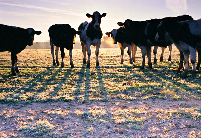
The sunrise photo at the right employs a fence and roadway to lead the eye to the rising morning sun, while the shadows of the cows themselves in the photo below serve to act as leading lines.

Take some time to look through my photos on my photo blog, Points of Light, or at my photo site on Flickr and try to identify the photos where leading lines were used. Some are very obvious, while others are more subtle.

Photographs © 2006 James Jordan. Click on pictures to enlarge.

Labels: ,

Tip: Find a frame

You can add interest to a photograph by framing your subject on two or more sides of the picture. Trees, rocks, fences or other natural or man-made objects can offer a number of possibilities.

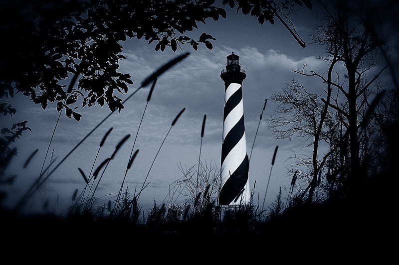
For example, while photographing the Cape Hatteras lighthouse on North Carolina’s outer banks, I squeezed myself into a wooded thicket at the edge of the clearing where the lighthouse stands and used the brush to frame the lighthouse.

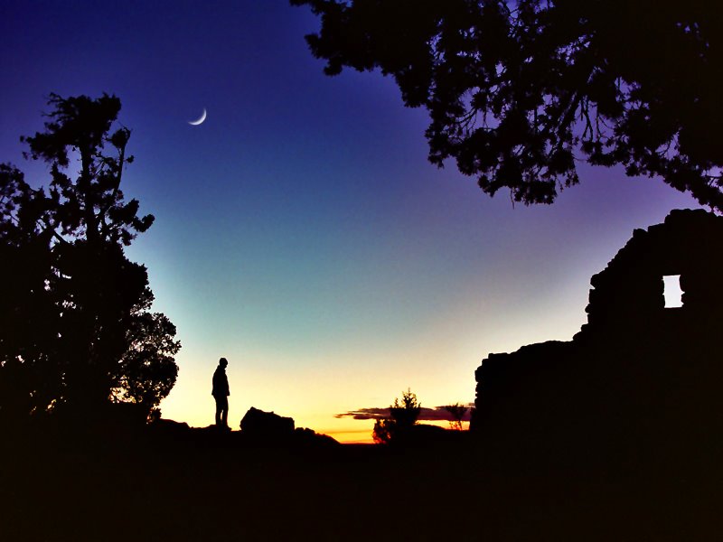
In the case of the lower photograph, taken at the south rim of the Grand Canyon at twilight, two trees and an old fortress provide a frame for the deepening sky, the moon and the figure standing at the edge of the canyon.

Sometimes, finding a frame is a happy accident, so be on the lookout while scouting an area in which you are taking pictures. Other times will take some ingenuity and perseverance to create a framing effect.

Photographs © 2006 James Jordan. Click on pictures to enlarge.


Labels: ,

Friday, December 22, 2006

Tip: Change your altitude

We go through the bulk of our days looking at everything from eye level – for most of us, about five feet above the ground. We’re just used to it. And most of the photographs people shoot are shot from the same altitude – five feet above ground.

Moving your camera out of the five-foot rut draws interest simply because your photo will offer a vantage point that most of us don’t experience all that often. So an easy way to add interest to your pictures is to change your altitude. Get up or get down – take pictures from up above your subject, or lower yourself (and your camera) as much as possible.

Try different levels when photographing a subject, then take note of those which you like, and more importantly, those that garner approving comments from people who view your photos.

Click on pictures to enlarge. Photographs © 2006 James Jordan

Labels: ,