Troubleshooting: From Okay to 'Oh, wow!'
Flickr has a number of groups where people can post their photos to get advice and ratings on a scale from one to five or one to ten. I found this photo of the lighthouse at Portland Head, Maine, posted in one of those groups.
This photo has a number of things going for it. It is nicely composed, with the lighthouse sitting on a diagonal line from the top left to bottom right of the photo. The photographer timed the shot just as a large wave broke against the foreground rocks, adding drama to the scene, and the sky is very interesting with the receding clouds providing a feeling of depth.
But it also has some problems. The photo is underexposed, muting all of the colors that I know are present in the scene, having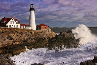 photographed at that very location myself. The dramatic clouds are nearly lost in a blue-gray mush of sky. Plus, the horizon line is noticeably crooked.
Looks like a job for PhotoShop!
There are those who feel that editing a photo on a computer is somehow cheating, but I don’t hold that view. In this case, the limitations of digital cameras had locked the scene within the confines of an okay photo. But I wanted to liberate the photo into an “Oh, wow!” image. The image information is there in the digital file, it just needed some adjustments to bring it out.
The first thing to do was to correct the horizon. In “Image/Rotate Canvas” I rotated the image 1.5 degrees counter clockwise, then cropped the photo.
Next, I compressed the high and low tones of the photo. This was done in the “Adjust levels” dialog box. I simply slid the left and right sliders toward the middle of the histogram. That brought the contrast back to an acceptable level and made the white tower snap out from the background. A good start. Next, I adjusted the Color balance by adding some red and a slight bit of yellow to warm up the photo, which appeared to be taken around mid morning in bright sunlight. I pumped up the color saturation by about 15 percent to bring out the colors of the outbuildings and sky.
I then selected the sky and foreground water with the rectangular lasso and polygon selector respectively, feathered the edges about 12 pixels, then adjusted the color balance of those areas toward blue. I then selected the darker foreground rocks with the polygon tool, feathered the edges slightly, the adjusted the levels on the selected area to brighten the rocks a tad. Some unsharp masking rounded out the session, which took me all of about ten minutes.
Get to know a photo editing program and play around a bit with some of your photos. As you can see, just a few simple adjustments can make a photo go from so-so to stunning.
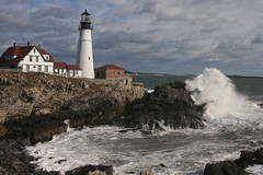
This photo has a number of things going for it. It is nicely composed, with the lighthouse sitting on a diagonal line from the top left to bottom right of the photo. The photographer timed the shot just as a large wave broke against the foreground rocks, adding drama to the scene, and the sky is very interesting with the receding clouds providing a feeling of depth.
But it also has some problems. The photo is underexposed, muting all of the colors that I know are present in the scene, having
 photographed at that very location myself. The dramatic clouds are nearly lost in a blue-gray mush of sky. Plus, the horizon line is noticeably crooked.
Looks like a job for PhotoShop!
There are those who feel that editing a photo on a computer is somehow cheating, but I don’t hold that view. In this case, the limitations of digital cameras had locked the scene within the confines of an okay photo. But I wanted to liberate the photo into an “Oh, wow!” image. The image information is there in the digital file, it just needed some adjustments to bring it out.
The first thing to do was to correct the horizon. In “Image/Rotate Canvas” I rotated the image 1.5 degrees counter clockwise, then cropped the photo.
Next, I compressed the high and low tones of the photo. This was done in the “Adjust levels” dialog box. I simply slid the left and right sliders toward the middle of the histogram. That brought the contrast back to an acceptable level and made the white tower snap out from the background. A good start. Next, I adjusted the Color balance by adding some red and a slight bit of yellow to warm up the photo, which appeared to be taken around mid morning in bright sunlight. I pumped up the color saturation by about 15 percent to bring out the colors of the outbuildings and sky.
I then selected the sky and foreground water with the rectangular lasso and polygon selector respectively, feathered the edges about 12 pixels, then adjusted the color balance of those areas toward blue. I then selected the darker foreground rocks with the polygon tool, feathered the edges slightly, the adjusted the levels on the selected area to brighten the rocks a tad. Some unsharp masking rounded out the session, which took me all of about ten minutes.
Get to know a photo editing program and play around a bit with some of your photos. As you can see, just a few simple adjustments can make a photo go from so-so to stunning.
Labels: PhotoShop, Post-processing, Troubleshooting
posted by James at
7:34 PM
2 Comments