Tuesday, January 30, 2007

Digital point and shoot cameras: Seriously good
When I was a young man back in the days when people listened to disco music and wore polyester and wide lapels, I worked as a sales clerk in a camera shop. My assigned territory included a case of point and shoot pocket cameras. If you remember those, they were slim, sleek and took a small cartridge of 110 size film. They also took lousy pictures. They had plastic lenses and offered no stability when you pushed the shutter button, all but guaranteeing blurry, discolored photos. It was my job to make those cameras seem like a viable alternative to someone who was not willing to shell out the money for a decent 35mm camera. I sneered at those cameras while taking sharp, colorful pictures with my trusty Canon 35mm SLR.

Fast forward to the present. Until recently, I regarded today’s point and shoot digital cameras with the same disdain that I held for the old 110 cameras. That is, until I used my son’s Nikon Coolpix L6 this past Christmas holiday to take our annual family portrait. I applied the things I’d learned over the last eight years shooting with a 35mm Nikon SLR, fiddled with the L6’s settings and took what turned out to be a very nice portrait.

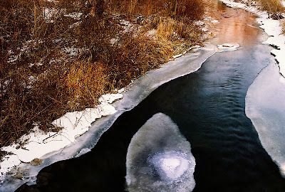
The photo at the top of this post was taken this past weekend with my daughter’s Kodak Easy Share C633 point and shoot. The level of detail is great and as you can see, the colors are fantastic, capturing the red sunset glow of the trees reflected in the water of the icy creek.

Here are my new overall impressions of point and shoot digital cameras:

1. Use a tripod whenever it’s feasible. Point and shoots are subject to shake like the old Instamatics. A tripod ensures a sharp photo. In the above photo, I even used the 2 second self timer so that not even the movement created by my finger on the shutter button would register. You don't know in advance how long the exposure time will be. Don't take chances.

2. Take it off automatic exposure and turn off the flash. Take a test picture. If it’s too dark, increase the exposure value (EV) by +1 and try it again. Still too dark? Bump it up some more. Too light? Decrease the EV until you’re satisfied, then shoot away.

The Kodak Easy Share C633 has a fixed f-stop, as I presume do most cameras in its price range. Not a big deal, but something to keep in mind and occasionally work around.

3. The pause between the time you push the shutter button and the time the picture is actually taken is maddening. Not much you can do about it. That’s another reason to use a tripod and the self-timer, at least if you’re shooting a subject that’s not moving.

4. Those things eat batteries. My daughter’s camera died before I was finished taking pictures. In contrast, I placed a battery in my Nikon film SLR when I got it home after purchasing it in 1998. I’ve never replaced it since, although I’m sure I’ll have to one of these days.

5. You’ll need to load the pictures to a computer and tweak them in a photo editing program to fully bring out colors and details, but it's worth it. That little LCD screen on the back of the camera really tells you nothing other than you’ve taken a picture. You can check composition and maybe focus and general exposure, but that’s about it. To fully evaluate the picture, get it on a computer.

6. With a little care and planning, a digital point and shoot can take some very decent pictures.

If you have one, take heart – you have a good photographic instrument on your hands, and this site will teach you how to get the most out of it. If you don’t and you’re a 35mm snob like I was, try one and see what it can do. Push its capabilities as far as you can. If you’re thinking of getting one, try to get one that can also go fully manual – those currently start in the $200 price range. If you want to get into some serious photography, you’re going to need it.

Photograph © 2007 James Jordan. Kodak Easy Share C633. EV set to -.5, ISO 80, flash off and self timer set to 2 seconds. Post-processed in Photoshop – increased color saturation and sharpened overall. Click on picture to enlarge.

Saturday, January 27, 2007

Embrace the V

In yesterday’s post I talked about a theory of composition that I’m forming. If you draw an imaginary line from any corner of your photo to its opposite corner, placing your subject or main item of focus anywhere on that diagonal line will result in a good composition. Go to a photo web site like Flickr, look around and you’ll be surprised at how often you see this in use.

I’m also seeing a lot of compositions that takes advantage of the “V” formed by intersecting the diagonal lines. A lot of photographs, like the one above, nestle their subjects into the crook of one of the “Vs,” again resulting in pleasing compositions. (See smaller diagram.)

With these two practices in mind, along with the good old rule of thirds, you have three weapons in your compositional arsenal. Now get out there and fire away!

Photo: Robinson Crusoe dream place uploaded by Nicolas Valentin to Flickr. Click on pictures to enlarge.

Bonus shot: The subject of this photo occupies a different "V." Check it out.

Labels: ,

Friday, January 26, 2007

Keeping it simple: Composition

A photographer with whom I had the privilege of working when I was a photo buyer had a slogan, “Simple pictures are best.” His pictures were indeed simple and among some of the best I’ve ever seen. I’ve tried to put his philosophy into practice since seriously taking up the hobby of photography eight years ago.

There are two sides to photographic simplicity. There’s the simplicity (or lack of it) in the final image that’s created. Then there’s the simplicity of thought that goes on behind the lens as the picture is being created. I believe the two are related. I’ve studied some complex photographic theories and tried to boil them down to a few simple basics that I regularly use in making pictures, and those are the things I share here at Ready, Aim, Click.

So here’s a simplification of some complex theories of composition. I’ll admit that this is brand new thinking on my part, and I have not had a chance to fully field test it, but count on it that I will.

The rules of composition are based on the golden mean, a classic school of thought based on mathematically-based subdivisions of space that create visually appealing patterns and designs. That’s the complex part. Here’s my simplification: If you draw a diagonal line from any corner of a photograph to its opposite corner, placing your main subject anywhere on that diagonal line will result in a pleasing composition. This assumes that your background is fairly simple and that it’s quite obvious what your subject is.

The large photo at the top has our subject floating on a diagonal line from the top left to bottom right of the frame. The smaller photos are crops that place our subject on various spots on the diagonal lines. The third introduces additional subjects on the opposing diagonal, which opens up other possibilities. Each change in placement creates subtle shifts in meaning for each photo; try framing up several possibilities the next time you're shooting, then decide which one works best for you.

Like I said, I plan to play with this idea and will post some results here in the near future. And I’m not declaring the rule of thirds null and void.

Yet.

Photos © 2007 James Jordan. Click on pictures to enlarge.

Labels: ,

Monday, January 22, 2007

Three reasons why you should invest in a tripod


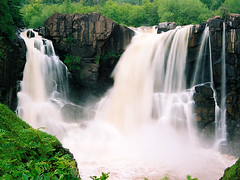
High Falls
Originally uploaded by James Jordan.
You’ll get sharper pictures. No one can hold a camera steady in every condition. Telephoto shots and close up macro work especially demand a tripod.

You’ll open up a world of photographic possibilities: Long exposures of flowing water, special-effects shots, low light and night pictures come to mind.

The act of setting up a tripod forces a photographer to think about the scene before him or her and take care in composing the shot while twiddling the knobs and cranks. Many times, good pictures became great pictures when I spotted something amiss or noticed an opportunity for a better location while trying to set up a shot. Taking up the camera and setting it up in a better position made all the difference.

Side benefits: With a tripod, you’ll look like you know what you’re doing and impress the socks off of the people around you.

Get the best tripod you can afford and put it to use immediately.

Click on picture to enlarge. Photograph © 2007 James Jordan.

Sunday, January 21, 2007

Shooting into the sun

After I had reviewed one of Roger’s photos and fixed it in a prior post here, he mentioned that he imagined that it would be possible to get some interesting photos by shooting into the sun and not sticking to the maxim of shooting with the sun over one’s shoulder all the time.

The answer is a qualified yes. You can get some very interesting photos while shooting into the sun, but you have to keep several things in mind when you do so:

Shooting into the sun will mess up your automatic exposure big time, and you must compensate. Don’t shoot into the sun unless you have an extremely interesting shape to silhouette against the sky. If you want any detail at all in the object against the sun, you either need a flash or a special filter.

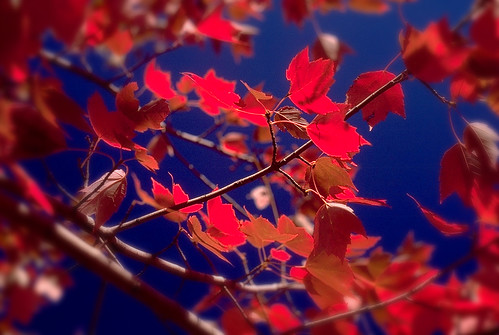
Compensating your exposure When the sun is going to be a major part of one of my photos, I’ll take a meter reading of the sky above the sun with the sun just out of the frame. This generally gives an accurate portrayal of the sky and will create a solid silhouette of whatever else is in the frame. The exception is when shooting flowers and foliage, which are translucent and glow beautifully when backlit. (Top photo) Any time you are using the sun to backlight a photo, whether it's in the photo or not, an exposure value (EV) of +2 is called for.

Interesting silhouette If you're going for a silhouette, it has to be very recognizable and interesting. It needs to be just as obvious to the viewer of your photo as it was to you. Keep it as simple as possible. (Second photo) Try positioning your subject directly over the orb of the sun for interesting effects (Top and bottom photos).

Want detail? If you’re close enough to the silhouetted object to use your flash, do so. But remember, too much flash will give your photo a “faked” look and too little flash will leave your subject in the dark. Improve your odds by using the portrait setting of your digital camera if it has one. Bracket your shots (shoot a picture each at one f-stop above and below your metered setting) if you are using a manual flash. (Third photo) You can also use a sheet of white poster board or foam board to reflect light back onto the subject.

If your subject is too far for flash, another option is the use of a graduated neutral density filter, if your camera is able to accept filters. A grad ND filter is dark on about a third of the filter’s surface and gradually fades to clear at about the halfway point. Positioning the dark side of the filter over the sky allows you to open your f-stop by up to four stops (depending on the strength of the filter) to give more exposure to objects on the ground. (Second and bottom photos were shot using graduated neutral density filters)

Most of all, experiment and have fun.

Click on pictures to enlarge. Photographs © 2007 James Jordan.

Labels: ,

A word about Digital Zoom

For those of you who own a digital point-and-shoot camera: Digital zoom is a marketing gimmick and nothing remotely useful for photographic purposes. Do. Not. Ever. Use. It.

Stick with optical zoom. Optical zoom records everything that can be captured by the lens itself. Once you go beyond the optical range into digital zoom, the camera begins to split pixels in an effort to digitally enlarge the largest image afforded by the lens. The farther you go into the digital zoom range, the lower the quality of the image.

If you’re trying to capture a picture of Bigfoot, the Loch Ness monster, a flying saucer or Elvis, I can perhaps see a use for digital zoom. Otherwise, stick to digital zoom.

You'll thank me later. That is, unless you run into Bigfoot, the Loch Ness monster, a flying saucer or Elvis.

Labels: ,

Thursday, January 18, 2007

So, what is your camera good for?

Feeling a little camera envy because you don’t have the latest and greatest or a boatload of accessories? Not confident your camera is able to take great pictures? Try this for a little inspiration (this only works for digital cameras – sorry, filmies):

Head over to Flickr.com. In the lower right corner of the home page, click on “Camera Finder.” Click through the various camera model lists to locate your camera and click the link. Then scroll to the bottom of the page that pops up.

You’ll see some amazing pictures that have been taken with YOUR model of camera and posted to Flickr. A drop-down menu lists various categories of photos that you can explore. Click on the thumbnails to enlarge the pictures or click on the photographers’ names to see even more good stuff.

Then come back here and ask me how you can take pictures like that.

Labels:

7 ways to improve your pictures!

Pro photographer Bruce Giffen offers seven pointers for improving the pictures you take. And in true Ready, Aim, Click fashion, these suggestions work no matter what type of camera you own:

1. Use a tripod for every picture for a year! (I’ll explain in a future post why shooting from a tripod is a must-do for every, and I mean EVERY photographer!)

2. TURN OFF THE ON-CAMERA FLASH, especially with digital cameras. It ruins the mood of most pictures. The exception would be the occasional fill flash image outdoors.

3. Break the rules! All of them. Forget the “Rule of Thirds”! Stop centering every picture. Slant the horizons. Distort with a wide angle lens. Shake the camera! Experiment!

4. Stop using gimmicks. Simple, straight photographs don’t need any gimmicks!

5. Break Rule 4!

6. Other peoples’ opinions of your work are not valid. Yes, a comment about a technical item may be appropriate, but YOUR composition isn’t negotiable! They are only telling you how THEY would have taken the photo if they were there, which they weren’t. Trust your own heart … Remember - Picasso would probably have flunked art class!

7. You can just document a subject or you can attempt to photograph the way it makes you feel. Take for example the Eiffel Tower. I doubt that there are any ways left to document it. But there are millions of ways to express the way it makes one feel. Go with your heart! Always!

Labels:

Wednesday, January 17, 2007

Troubleshooting: Lost lighthouse

A friend submitted this photo for a critique and to see if anything could be done to improve it. This is the Crisp Point Lighthouse near Paradise, Michigan on the south shore of Lake Superior. Judging from the shadows, this was probably taken in the early afternoon. The sunlight is quite harsh at midday, and it is always better to try to take outdoor photos in early morning or late afternoon. The light is softer and warmer at those times of day. I know it’s difficult when traveling to make accommodations for early morning or late afternoon shooting, but it’s always worth the effort as far as photos go (this particular lighthouse is way off the beaten path, so you have you take what you get, conditions-wise). My family has come to the understanding that when we’re traveling, dad is going to be out early in the morning and late in the afternoon into early evening taking pictures. The rest of the day is for accompanying the family to shopping or other activities.

But back to the picture at hand. My friend knows enough about composition to put the main subject, the lighthouse, in one of the outer third corners of the picture, but he still came away with the feeling that something may be off. To me, the biggest problem is that the lighthouse seems to be lost in the trees. While my friend established a foreground, middle ground and background in his picture, the trees in the middle ground, through the visual magic of perspective, seem to be as tall as the lighthouse and compete for attention with the tower. So the first order of business is to explore some cropping options to try to isolate the tower and minimize the distraction of the trees.

I explored both a horizontal and vertical crop. I focused on getting the large tree at the left of the picture just out of the frame, keeping as much of the horizon of the lake as possible and minimizing the tall thin pine tree to the right of the tower. I then moved the vertical crop up and down to see if I liked it better with more sky or more foreground foliage. Personally, I prefer the crop with the foliage on the dune, but you can go either way.

A little darkening of the middle tones and a slight boost in color saturation in PhotoShop rounded out my adjustments of the picture. The lighthouse now stands as the undisputed focal point of the photo. By the way, my friend has more photos and some thought-provoking posts at his blog. Check it out.

Do you have a picture you would like critiqued or fixed? Send me an email at jjrdns6[at]aol[dot]com and write "Troubleshooting" in the subject line.

Click on pictures to enlarge.

Labels: , ,

Add depth to your thinking


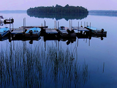
Tranquility
Originally uploaded by James Jordan.
I took a landscape watercolor painting class while studying art in college. The instructor was the stereotypical artist – white hair, goatee, elegant dresser. As we developed our compositions in class, he walked from easel to easel repeating his mantra, “Foreground, middle ground, background … foreground, middle ground, background.”

It was his way of drilling into us the discipline of creating depth by including details from near to far. Too often, beginning landscape photographers focus on the beautiful background in their pictures. If any middle ground detail makes it into their pictures, it’s a happy accident, and foreground is rarely given any thought. The results are rather flat-looking pictures.

The next time you are composing a picture, try to highlight all three zones – foreground, middle ground and background. And this isn't just for landscapes. When I take snapshots of family, I still pay attention to the three zones - it helps establish a sense of place while adding depth to the picture. I shoot the largest percentage of my photos at a wide angle setting, which helps accentuate depth.

Establishing three distinct zones in a photo is tougher than it sounds, and it takes some practice to become consistent at it, but it makes for more interesting photos.

Click on pictures to enlarge. Photographs © 2007 James Jordan.

Labels: ,

Tuesday, January 16, 2007

Going deeper: The power of diagonal lines


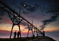
Dusk at South Haven pier
Originally uploaded by James Jordan.
Photographs are two-dimensional images (or at least they will be until they come up with a way to make cheap holograms!). As such, a challenge for photographers is instilling a 3-dimensional quality to their pictures. There are several ways to build depth into a photo. One of the easiest ways is to look for diagonal lines. The eye is trained to interpret diagonal lines as receding into the distance (think railroad tracks or a line of light poles by the side of the road). Any time you can work diagonal lines into a photo, do so. Even better is making the diagonal lines lead to the focal point of the picture.

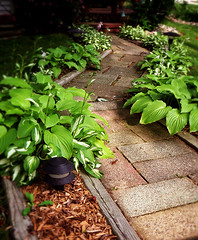
In the examples here, the converging diagonal lines of the pier and catwalk give the impression of depth (a bonus is the two fishermen framed in the support of the catwalk – a third fisherman is framed further down the pier). In the second photo, the alternating diagonals of the winding walkway emphasize depth.

Now, go out there and get crooked!

Photos © 2006 James Jordan. Click on pictures to enlarge.

Labels: ,

Murphy must have been a photographer!

Some of Murphy’s laws pertaining to photography. I’ve experienced many of these myself!

Automatic cameras aren't

Auto focus won't

If it's stupid but it works, it isn't stupid

Success occurs when no one is looking, failure occurs when everyone is watching

The one item (batteries, film, etc.) you need is always in short supply

Interchangeable parts aren't

Long life batteries only last for a couple of rolls

Weather never cooperates

Everything always works in your home, everything always fails on location

For every action, there is an equal and opposite criticism

There is always a way, and it usually doesn't work

Stunning nature shots invariably happen on two occasions: 1)When animals or the weather are ready. 2) When you're not.

Same rule just substitute children

The important things are always simple

The simple things are always hard

A clean (and dry) camera is a magnet for dust, mud and moisture

Photo experience is something you never get until just after you need it

Lenses are attracted back to their source - hard rocks. Corollary: The more expensive the lens, the greater the attraction.

The greater a photographer's excitement, the greater the chance of fogging film, scratching prints, and deleting files.

As posted in the forums at fredmiranda.com. Hat tip to Denver Photo on Flickr.

Labels: ,

Saturday, January 13, 2007

Troubleshooting: Underexposed portrait


Turning teenager
Originally uploaded by Phil Widewood.
There are a number of groups on Flickr where beginning photographers post their pictures for others to critique and offer advice. Some of them ask others to “fix” their pictures for them in a computer photo editing program. Ready, Aim, Click will feature some of those photographs from time to time to pass along some tips to help you make better pictures.

This is a candid photo of a gentleman’s 13-year-old daughter. She’s making the transition from childhood to adulthood and anyone who has raised teenagers knows *that* look. This photo is quite nicely done; the framing is good, as is the focus. It successfully captures a spontaneous moment in the life of a young adolescent. The photographer did well in using a zoom setting. Facial features are portrayed better with moderate zooms than with wide-angle or extreme zoom (professional portrait photographers use a moderate telephoto lens).

There is a problem with the exposure, however. The bright background behind the girl tricked the camera into thinking the subject was brighter than it really was and rendered the photo too dark overall. The photographer should have used an exposure value (EV) of +1 to compensate. The girl’s creamy complexion and gorgeous green eyes are lost. The second photo shows the portrait with the exposure corrected in PhotoShop. There are the eyes!

The third photo shows a tighter crop on the face and a softer focus on the girl’s ear. For some reason, having it in sharp focus was a distraction from the main part of the picture – her eyes.

Do you have a photo that you'd like critiqued? Fixed? Send an email to jjrdns6[at]aol.com and write "Troubleshooting" in the subject line.

Top photo: Turning Thirteen posted by Phil Widewood on Flickr. Click on pictures to enlarge. Ready, Aim, Click © 2007 James Jordan.

Labels: , ,

Wednesday, January 10, 2007

Bringing interest to the obligatory “we were there” pictures

You know the ones. You visit the mountains or the rocky beach or the untamed wilderness and you line up everyone to stand in a group to look straight into the camera with whatever gorgeous scenery you can still squeeze into the frame behind them. The result is usually a little too much of each (loved ones and scenery) and not enough of either.

When traveling, I’ll usually take one of the above-mentioned shots just to make those who insist on that type of thing happy. Then I’ll go to work creating an environmental portrait of each person who came along. We didn’t come to the place to stand in front of it; we came to see it, to experience it, to interact with it. So that’s the way I want to depict us. I will take candid or loosely posed pictures of people interacting with the environment, not standing stock-still in front of it.

I’ll take photos that show more environment than person, then switch to show more person than environment, leaving just enough clues as to where we were. I also follow some of the other tips I've mentioned on this blog (change your altitude, get out of the center, etc.). What I’ll wind up with is a good variety of interesting shots that then become excellent fodder for scrapbooking (for my wife), or in my case, photo blogging.

These are some photos of the ladies in my life (wife and daughters) along the Lake Michigan shoreline in northern Wisconsin. They give a good sense of the places we visited as well as the special people in my life who visited there. And they're a lot more interesting than if they had stood stock-still in front of the camera.

Photographs © 2007 James Jordan. Click on pictures to enlarge.

Labels: ,

Sunday, January 7, 2007

Rule of thumb: Red rule

I learned the Red Rule from a newspaper photographer. He simply told me, "If you see red, shoot it!" Since then, I've taken note of all the red that shows up in photos that appear in newspapers and news magazines. There's even a group at Flickr dedicated to following the Red Rule, to which I've submitted a few scarlet scatterings of my own.

Red commands attention. These photos show a frame full of red and just a spot of red in a scene, and that both can be effective in drawing attention. So get out there and shoot some pictures that will have your viewers seeing red.

Photographs © 2007 James Jordan. Click on pictures to enlarge.

Labels: ,

Friday, January 5, 2007

Seeing the way a camera sees, Part 2

The camera sees less than half of what you can see

Where the camera has the human eye beat as far as the detail it can “notice,” the human eye humiliates the camera when it comes to the amount of light it can detect.

If the human eye were a camera, it would be able to adjust from an ISO range of 1 to 800. That gives us the ability to distinguish about 10,000 levels of light from total black to total white (about 10 and a half stops). The camera (or rather, film or a digital sensor) can at best record about 5 stops of light at any given ISO rating.

So, on average, your camera will not even be able to record half of the tonal range of what you see in a given scene. This will explain why what you could clearly see in the shadows of a brightly lit scene come out as a totally black blob in your photo. Or why those details in the snow are lost in a glare of white on your computer screen or print.

To give yourself an idea what your camera will record in a given scene, squint your eyes until they are a little less than halfway open. If you don't like what you see, you probably won't like a photograph taken of it either.

The best way to help the camera out is to avoid as much as possible taking pictures in very contrasty lighting, such as that found at midday. The light found a half-hour either side of sunrise and sunset (referred to by photographers as the “golden hours”) is less intense and more ideally suited to the limitations of the camera.

If you find yourself having to shoot in bright, contrasty light, the use of a flash unit to “fill in” shadow areas can improve your results.

Labels:

Wednesday, January 3, 2007

Seeing the way a camera sees, Part 1:

For better or (usually) worse, it sees everything

How many times have you stumbled across what seemed to be a picture-perfect scene, raised your camera and clicked away, only to be disappointed in the results? Where did those huge black areas come from? Why are the highlights blown out, and how did that lovely grove of trees become a big jangle of haphazard branches? Why are the faces so dark? They looked just fine in the viewfinder!

The simple explanation is that the camera does not “see” a scene the same way the human eye does. It captures the scene on its own terms, not necessarily yours. Once you learn the limitations of the camera, you can begin to use those characteristics to your advantage, and you’ll find yourself becoming victimized less and less.

Cameras differ from human vision in two main ways (there are others, but for the beginner, overcoming these two will keep one plenty busy). The first way is that the camera sees absolutely everything that is placed before it, where humans have a tendency toward selective vision – seeing what we want to see and disregarding the rest. You see your lovely children posed on the beach. The camera sees the distant post growing out of your child’s head, the tangle of kelp in the corner of the picture and the seagull flying at the odd angle in the background as if to attack your subject.

When setting up your shot, purposely take a few seconds to scan the entire frame and force yourself to look for potential distractions, then remove them or reposition yourself to eliminate them. The handler of the great horned owl at the right was quite patient as I spent a couple of minutes shifting myself around in an effort to eliminate as many distracting background elements as I could. I moved in closer, zoomed in with my lens and used aperture priority with a low f-stop to throw the background out of focus – three things you can do to help defeat the camera’s tendency to be brutally honest. (And by the way, when shooting closeups of people or animals, try to focus on the eyes.)

Photograph © 2006 James Jordan. Click on picture to enlarge.

Labels:

Monday, January 1, 2007

Tip: Avoid the middle of the frame

A sure giveaway of a newbie photographer is a picture that neatly centers the subject smack dab in the middle of the frame. Here’s a tip: Avoid the middle as much as you can.

Classic rules of composition divide the viewing area into thirds: Two lines divide the vertical and horizontal dimensions of your photograph. Where the vertical and horizontal lines cross are where the subject tends to look best. While this rule is not always hard and fast, you’ll find that most photos taken by competent photographers place the subject in the vicinity of these intersections.

There will be times when a symmetrical composition is called for with a subject centered either vertically or horizontally in the frame, but for now, concentrate on getting your subjects out of the center.

Photographs © 2007 James Jordan. Click on pictures to enlarge.

Labels:

Searching for Mr. Good Light

Early morning and late afternoon offer the best light of the day. The sun is low in the sky, harsh shadows are minimized and the light is warmer. Try to avoid taking pictures outdoors at midday, when the light is harsher, cooler and casts nearly vertical shadows.

Overcast days provide soft, even light that allow you to capture a full range of detail in your photos. Overcast skies can be quite dull, so try to minimize the amount of sky in your photos on these days.

In the absence of advanced lighting equipment, pleasing portraits can be made outdoors on overcast days. Moving the subject into a shaded area on a sunny day also works well. Be careful, however, to minimize bright sunny areas in the background behind your subject.

Photographs © 2007 James Jordan. Click on pictures to enlarge.

Labels: ,